
I am still continuing to develop my creative design skills. When it comes to personal projects, I try to tackle every aspect of content creation. It provides me with a deeper understanding of the programs, which in turn makes it easier to communicate ideas with creatives.
The following images are examples of my work, along with a brief explanation of the process I used to create them.
Above is a logo I developed for a watch brand. It’s a high-concept brand, based on a village in Norway called Solvorn. Essentially the entire watch collection is inspired by this setting, so the brand and its logo needed to reflect that. Each color is actually color-dropped from images in the setting: the green from the unique fjord water; and the red/burnt yellow from the contrasting boat-houses.
This brand also has a significant heritage component. This is the village that my last name derives from. I wanted to have a subtle nod to that – which is where the scope in the ‘O’ was inspired, and the accompanying hammer – to create Skophammer.
Solvorn is this quaint, yet brightly colored village which contrasts the overbearing fjord landscape. I wanted to create a brand that captured this. The branding/content is the minimal/color pop, to the striking designs of the products. That is why we went with a geometrical sans serif font (Gotham). It also becomes universally understood, so if we expand into other markets it can still make sense.
EPOCH ATHLETE 2.5D VIDEO
This was a project I created while working at Epoch Lacrosse. It’s a “2.5D” effect created in Photoshop. I cut out the subject using a smart fill to fill the empty space in order to match the background. With the subject on a different layer than the background I used the timeline to change the foreground image size against the background image size. The result is this moving effect that appears almost three dimensional. The final step was to use premier pro and group all of these players into one cohesive video.
ILLUSTRATOR CARD SERIES
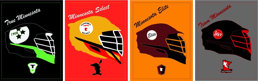
This was an Illustrator project to create a series of cards. I chose Minnesota club lacrosse teams as my subject. I spent a majority of the project tracing images. Once I had tracings for each helmet and team logo, I formatted them into one image with equal spacing.
